Hello all! As I am finalizing the SDP one hour visuals, I wanted to double check some of the styling of the different deployment models exhibited at the beginning.
Here is an example model (Client-Gateway) that has all three elements represented.
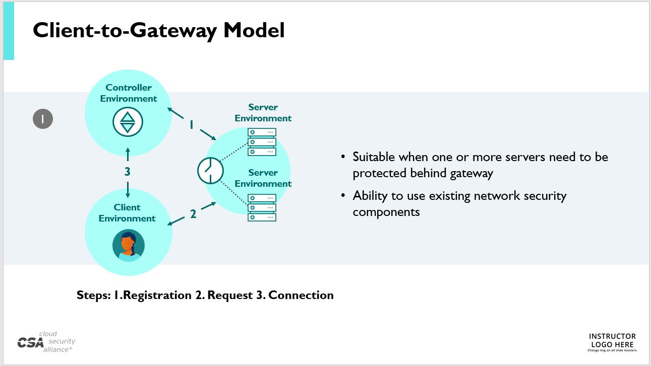
What do you like/dislike about this graphic? Are the icons clear enough? Do the arrows/type need more distinction? Do the colors read well to you?
Thanks much, I appreciate any and all feedback!
------------------------------
Stephen Smith
Graphic Designer
Cloud Security Alliance
Bellingham WA
------------------------------